Logo
Typography
Colors
Assets


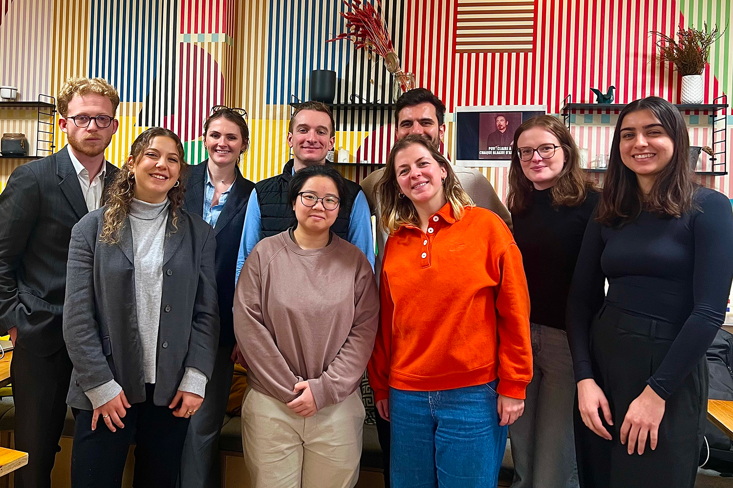
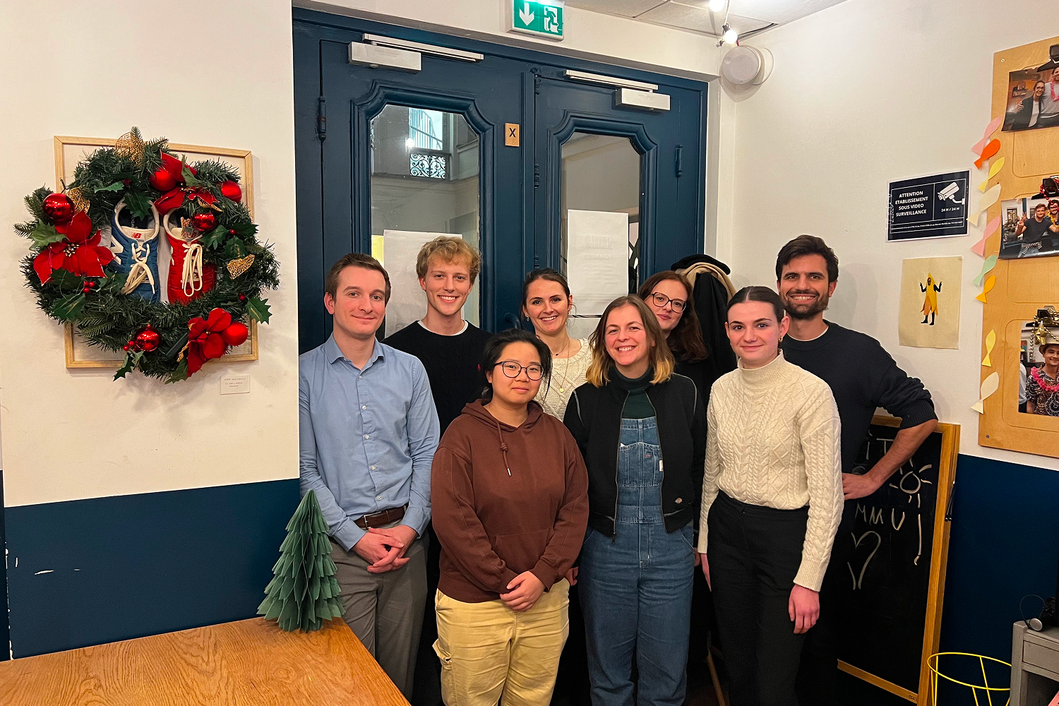
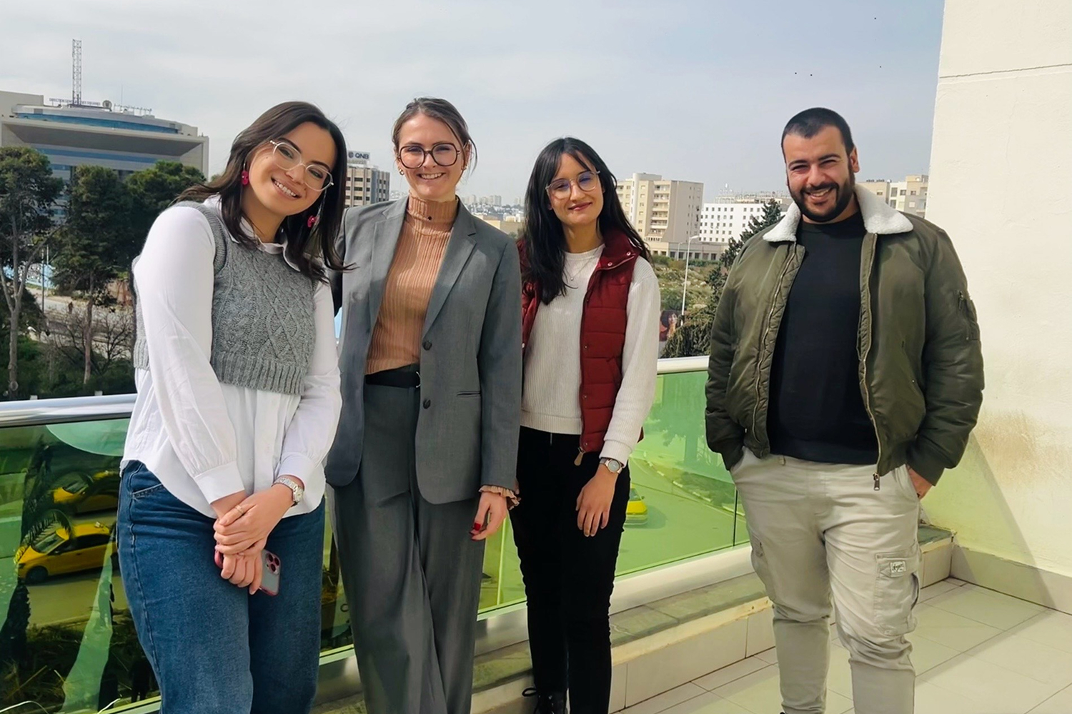
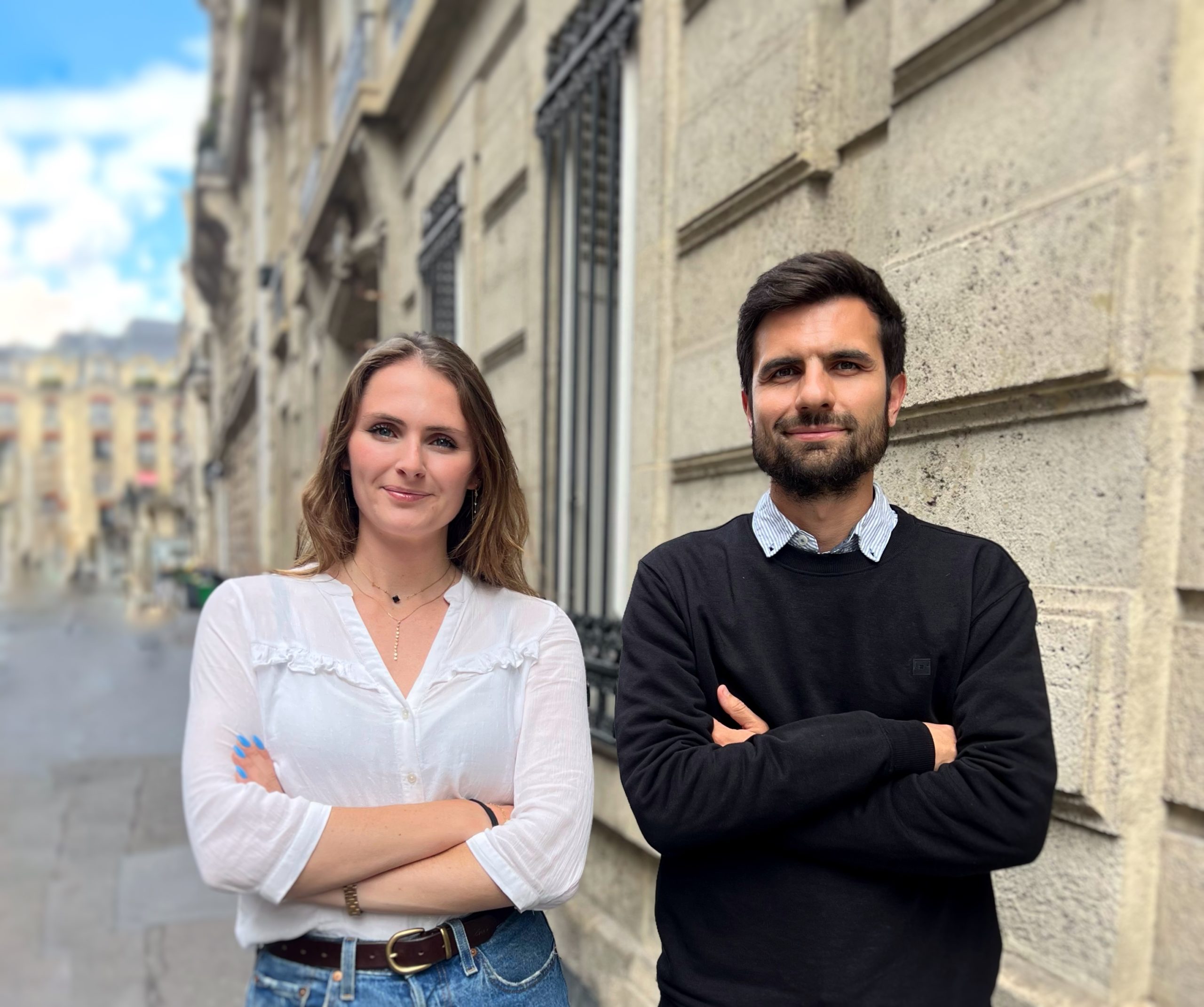
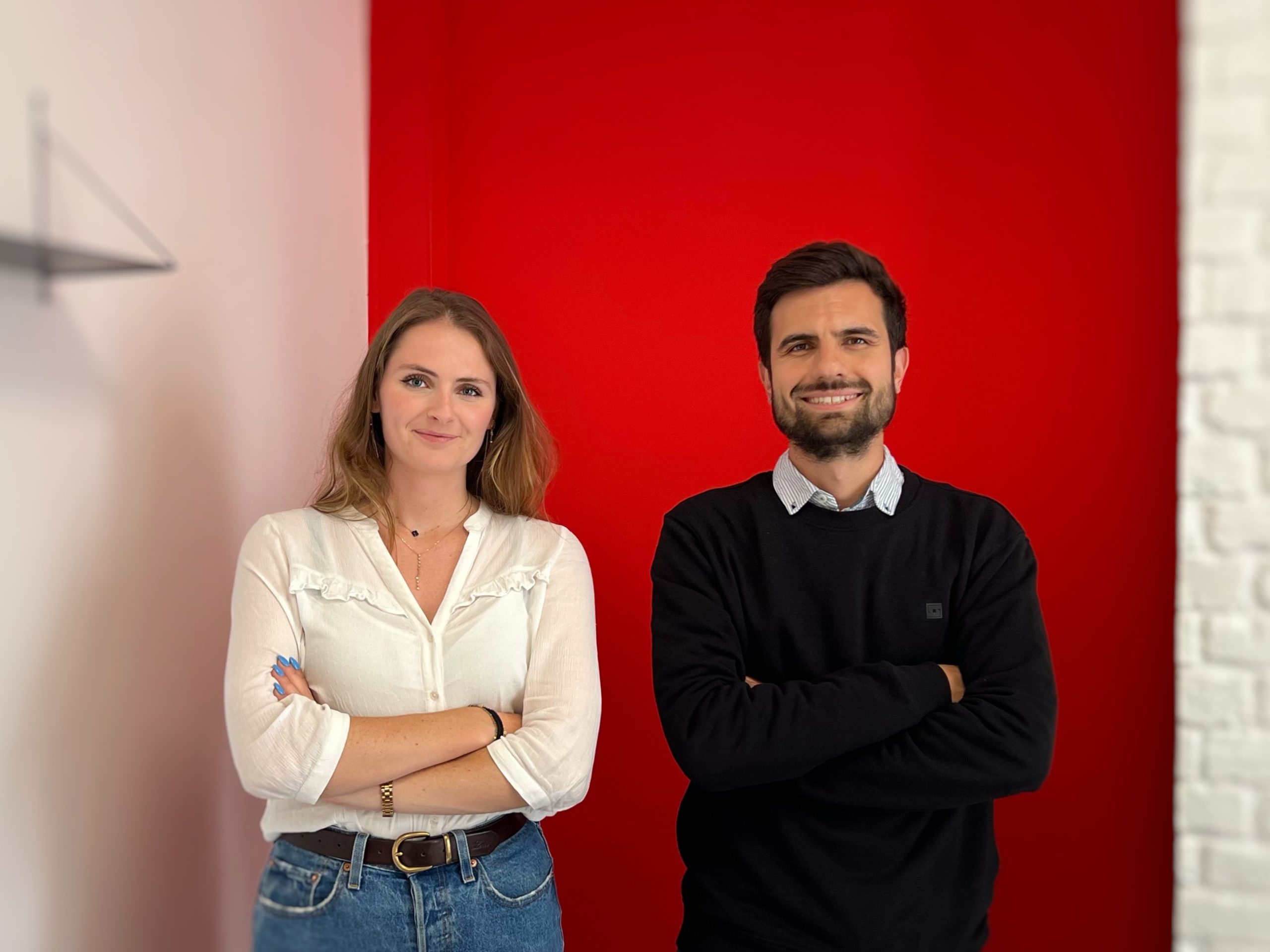
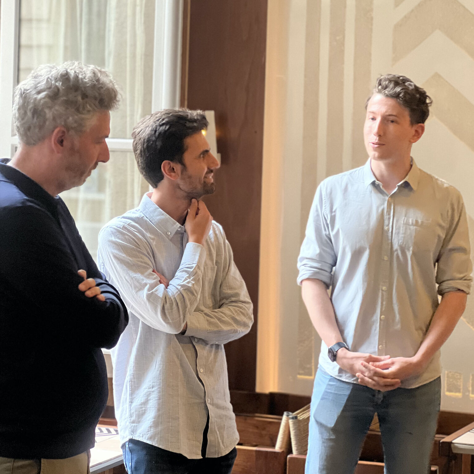
Team Photos